
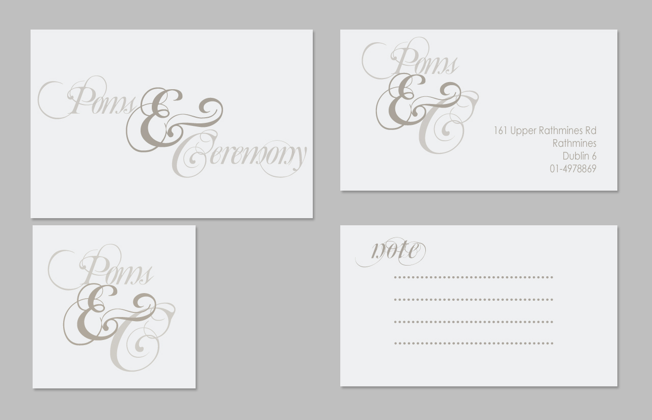
Poms and Ceremony is an interiors and gift store in Rathmines dublin. I recently created this logo for them for the launch of their online store which is coming soon 🙂
I was really happy with this logo. I tend to think my design ability is not exactly on the strong side but I enjoyed making this logo and perfecting it.
The script needed to be cursive but legible and there needed to be variations of the logo to accommodate square buttons.
I used Mutlu Ornamental for the font and edited it to help with legibility and swapped out the s as the original looked a little too much like pomp and ceremony which would defeat the pun the store is making in the first place.
I really wanted to focus on the proportions and so created both the full and variation logo to the golden ratio grid. I think it makes it look more balanced and was easier to consider scale changes with the grid constrictions.
Ironically conforming to the gird gave me the chance to experiment around with it more.
As to the colours, pink was to be avoided to attempt to distance the brand from the overtly girlie feel, and so I went with a duck egg and French grey, thats not girlie at all :P.
I really feel it reflects this beautiful shop, with its fun and creativity, an avant garde little haven filled with vintage and hand painted furniture, china sets and cake stands that layer up as tall as you like,
Melt scented candles that once you get a wiff of you crave no other scented candle! The walls are lined with paper poms that the shop specialises in making along with beautiful paper flowers, some of which are giant.
Right out of wonderland stuff, a great place to get lost in and chat to the staff about interiors and gifts, they really know their stuff when it comes to vintage furniture and china!
A visit always stocks up my imagination, and the paper flowers really look awesome in my living room!

nice work
Thank you! Appreciate it 🙂